energy
analyzing energy economics data
Back in 2022, I had the exciting opportunity to collaborate in a data visualization project for the Universidad de La Matanza, being my very first steps in analyzing data.
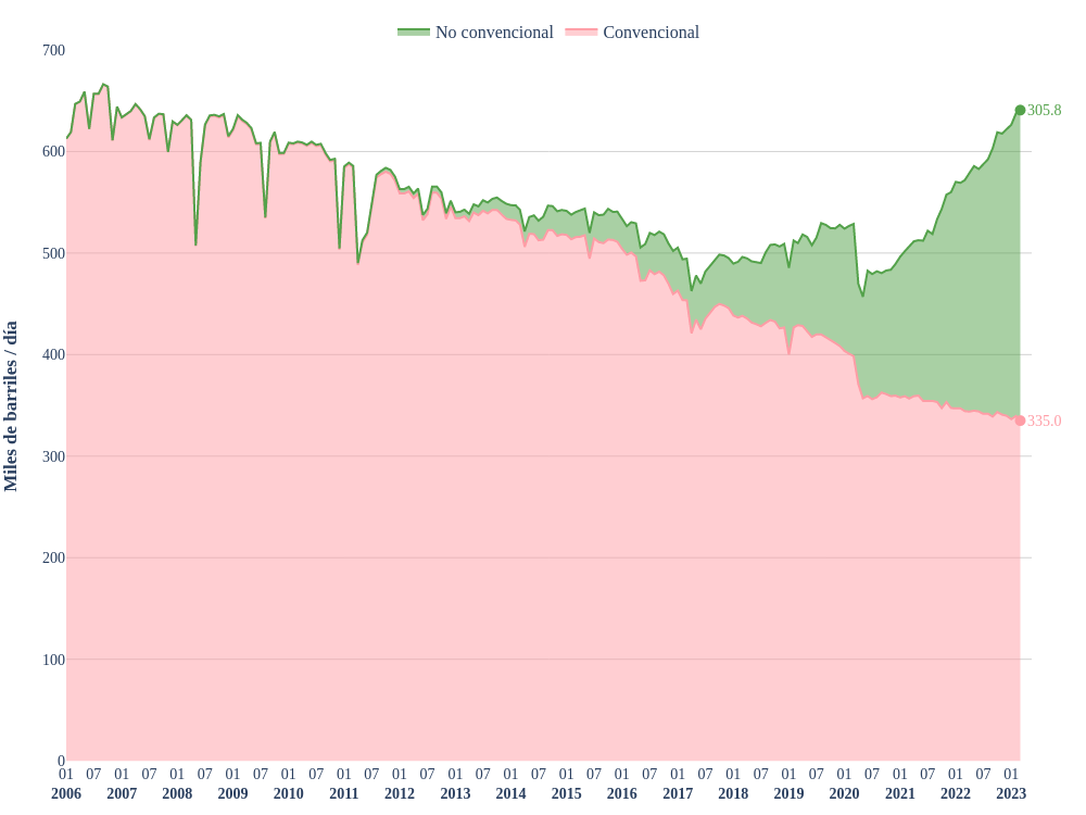
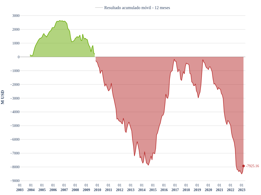
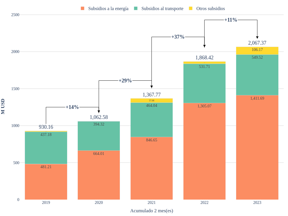
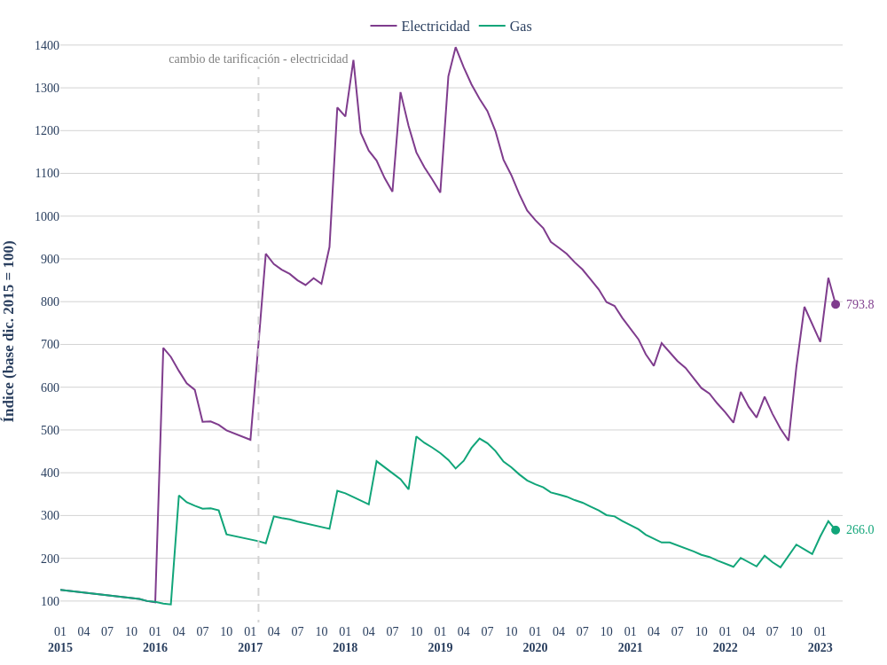
The objective was to craft a visually engaging monthly publication featuring key energy economics indicators. From sleek charts to insightful plots, the goal was clear: present complex data in a format that was both accessible and compelling.
I was responsible for managing the entire data workflow, from extraction and processing to visualization. To improve efficiency, I applied web scraping techniques to automate data collection, which allowed the project to maintain a consistent and timely publication schedule.
The Github repo for this project can be found at manzisebastian/Energia-UNLaM.
Since the project focused on static visualizations for publication in PDF format, all charts and plots were designed as non-interactive, high-quality static figures. Below, you can explore a selection of visuals from the final edition I contributed to.


