Econ
economics is what economists do
Just as Ma-py-tas showcases years of mapping across diverse topics, this collection represents another long-term journey. However, this time, the focus is narrower, as every project here has a common thread: Economics. From intricate graphs to insightful analyses, these works reflect my desire to explore the patterns and stories behind economic data.
The Github repo for this project can be found at manzisebastian/Econ.
reserves
Every single day, at around 16:00 Argentina time, people (mostly economists and Economics students) crowd into the Central Bank of Argentina’s (BCRA) (official Twitter account) anxious to know the daily change in the Foreign Exchange Reserve stock. Using the API of the BCRA, I gathered data for these daily changes from January 1997, and plotted them into the following interactive heatmap. One can distinguish at a glance bad days—dark red ones— from good days—dark blue ones—.
fiscal
The debate about Argentina’s fiscal performance is a hot topic in both academic and public discourse. The following two charts aim to provide measurable insights of some economic variables that are crucial when it comes to assessing fiscal challenges: the difference between primary and fiscal balance, and the composition of the latter.
In particular, the fiscal balance can be disaggregated into the economic and capital result, as shows the following chart.
As a side note, this project was originally uploaded to Alphacast back in 2022, although the code used in that project (much more basic and not API-integrated) was not published.
budget
The Federal Budget (el Presupuesto) is often considered the mother of all laws, as it is a detailed description of all government resources and expenditures. In this ongoing project, I am analyzing the key questions of the budget: who spends?, in what? & which means are being used?
My plan is to build an interactive visualization that answers those questions directly while ensuring that data is presented in an understandable and appealing way. For that purpose, I am extensively using new visualization techniques and interactive features. The following Sankey diagram is a snippet of this project: a graphic analysis of the 2024 Federal Budget.
homeownership
Back in May 2024, two economists at the Federal Reserve, Daniel Dias and Joao Duarte, published a note in the FEDS Notes, in which they showed that monetary policy shocks had an effect over the homeownership rate in the United States.
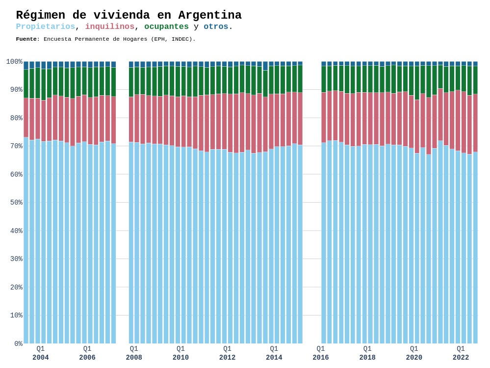
Together with a colleague, we embarked in a project in order to get estimates for Argentina. Even though the project is still in preliminary phase, we used available data for other projects we had in mind. In particular, the following visualization made extensive use of {eph}, an R package that provides Argentina’s Permanent Household Survey (EPH) microdata. Using variables related to type of tenure of household, we plotted estimates for the homeownership rate in Argentina from 2003Q3 to 2022Q4.
